
By Russ Unger, Chief Experience Officer; Brad Nunnally, Senior Director of User Experience; and Steve Fultz, Associate Director of Experience Design
Read Part 1 and Part 3 of our Applying a Flexible Discovery Process Series.
Human-centered design and discovery processes can sometimes appear to be “invisible work”—it’s work that happens without lines of code produced, systems created, or other tangible artifacts. There’s a lot of divergent and convergent thinking and exploration during this process, produced in the form of sketches or small pieces of work that don’t show up until a more fully formed design is ready.
In this second article in our Flexible Discovery Process series, we detail and shine a light on the invisible work inherent within the rapid sketch prototyping phase of the Discovery process. Using our work with an international security customer, we will demonstrate how we created a plan and validated necessary resources, assets, and design direction to quickly move through the design process.
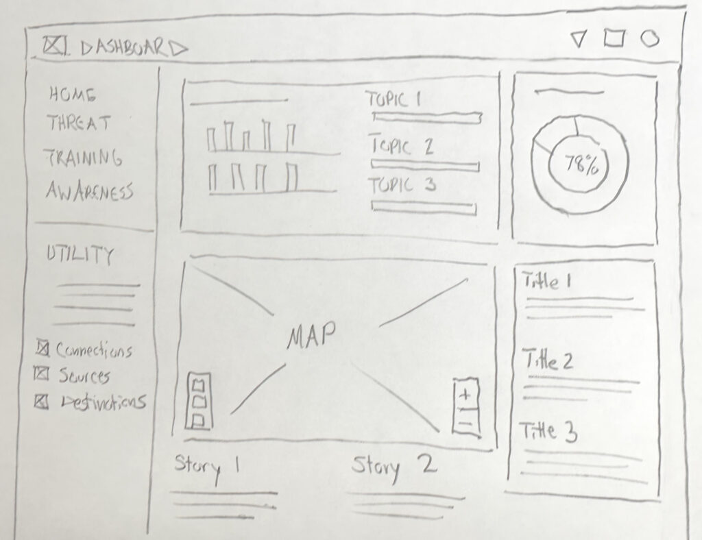
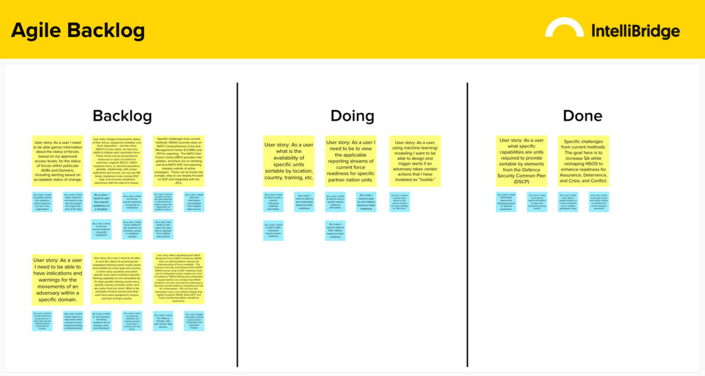
Our previous efforts – detailed in the first article of this series – encompassed user research and requirements gathering, delivering our Readiness prototype design. From there, we distilled the research into concise goals that we wanted the design to accomplish, such as the creation of clear paths to the information and analytics that were based on the specific tasks our users would be performing. We created focused user stores by refining our requirements from Epics and explored various UI components through co-design sessions with users. These sessions provided valuable feedback and insight, helping to establish a solid foundation for our prototype.
Setting Up the Design: From Epics to User Stories
The Epics we were working with needed to be distilled into actionable user stories that had a clear task and a clear definition of done. We created user stories that focused on how a user would navigate the application to find the level of readiness information that they needed to accomplish a task.
We understood that our user stories would need to consider the consolidation of metrics from the categories of personnel, equipment, supplies, and training, while also allowing the user to be able to get granular details from each category.
Based on our user stories, we prioritized the following focus areas for the application:
- Customizable Dashboard – We created a baseline dashboard for an analyst, keeping in mind that dashboards would need to be customized by users to meet their working needs.
- Regional Readiness – We needed to provide an overview of the readiness in a region that presented high-level readiness for Personnel, Equipment, Supplies, and Training.
- Training Readiness – A Training dashboard was needed that could provide an overview of readiness for each upcoming training, with the ability to drill down to a granular, individual level.
- Predictive Readiness – We explored ways the system could display current known readiness of red forces, the blue forces in the vicinity, as well as apply predictive analytics to scenarios.
Designing the System: From User Stories to User Interface
While we were creating user stories, we were also working in tandem on site design, referencing the United States Web Design System (USWDS) for guidance. The USWDS offers out-of-the-box 508 compliance components, as well as responsive design support, allowing us to design more easily for various device screen sizes. This resource allowed us to focus on the unique challenges of our application rather than getting distracted by common user interface elements.
We researched our customer’s publicly available material to help us incorporate their identity and branding elements into the application. Following commonly used data visualization patterns, we laid the foundation of our modified design system. The dashboard layout follows commonly used patterns that maximize the content area, while filters and navigation are kept to a smaller scale.
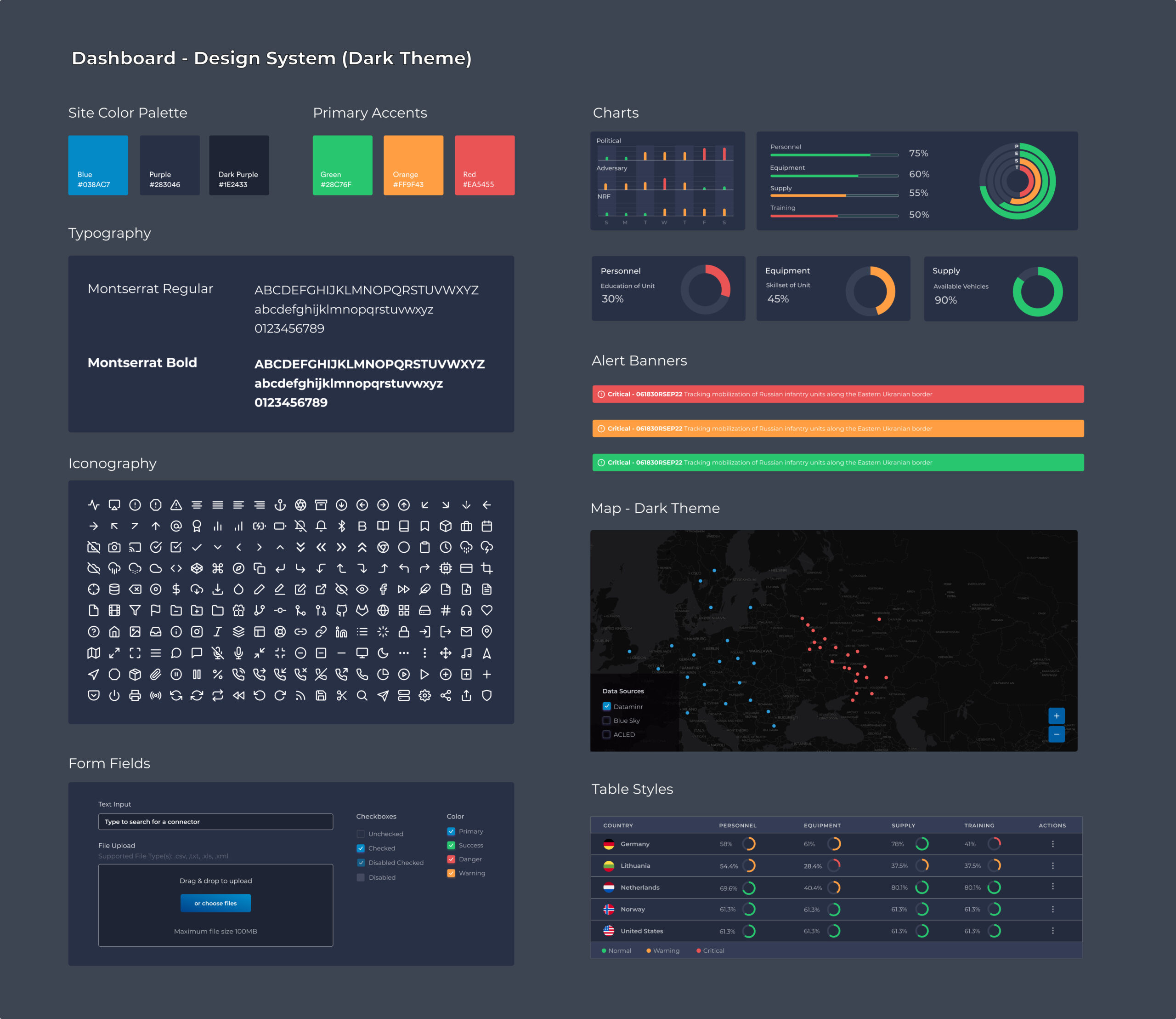
We chose a dark-mode theme for the project to ensure the most important content was easily scannable and to reduce distractions from the surrounding UI. Once the color palette, typography, and iconography were finalized, core elements such as tables, maps, and charts were quickly built out, only slightly modifying the USWDS to maintain momentum.
Building on the Prototype Foundation
To ensure consistency and streamline design efforts, customized UI elements were created as reusable components in Figma. This tool provided us with the ability to modify an instance of the component design and have that change proliferate globally, thus speeding up overall design time as we iterated.
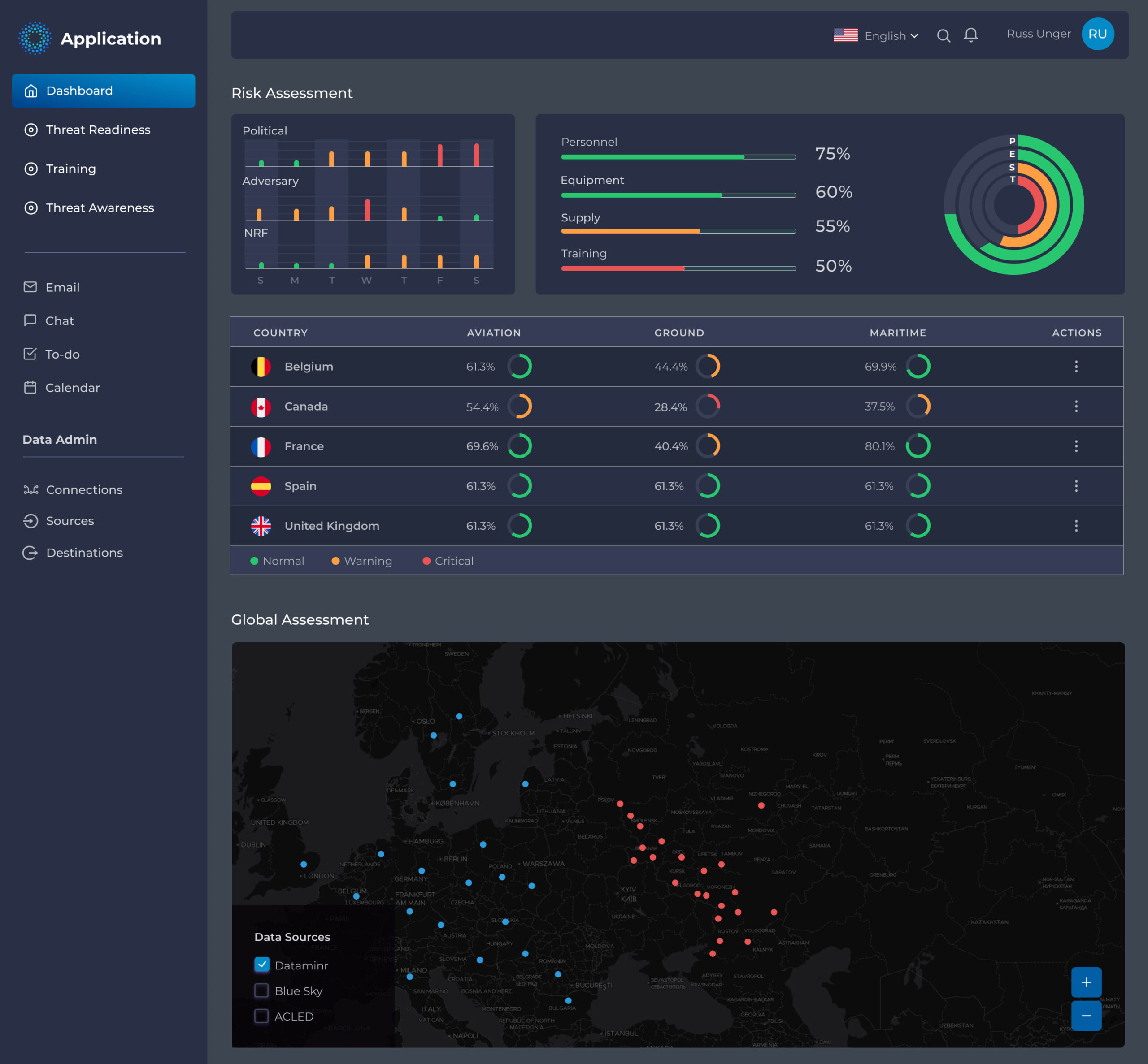
With our design system and custom components in place, we began prototyping in Figma. We used the Epics to guide our application navigation and the user stories to guide functionality and demonstrate future capability, including:
- Top-level Navigation – Allowing the analyst to move from one focus area to another
- Dynamic chart functionality – Distilling data into actionable insights for real-time decision-making
- Expandable tables – Displaying a summary view of Readiness data that allows analysts to drill-down and access specific details.
- Data-rich and interactive maps – Providing customizable data views layered over geospatial locations.
- Alerts and notifications – Delivering real-time awareness of prescient information
Next Up: Discovery Conclusion & Prototype Delivery
Following the rapid sketch prototyping phase of discovery, we reached a number of critical milestones: 1) We were fully aligned on epics and user stories; 2) We developed the high-level visual direction of the application; and 3) We prototyped our first scenario, which included the initial dashboard for an analyst. Our team partnered with our user to explore appropriate and useful interactions on the Dashboard, providing insight into how to design the remaining scenarios. Through this process, we created a thorough narrative that details the user experience to expose granular data from summary information.
Stay tuned for the next article in our series, where we’ll discuss the final prototype and narrative walk-through.